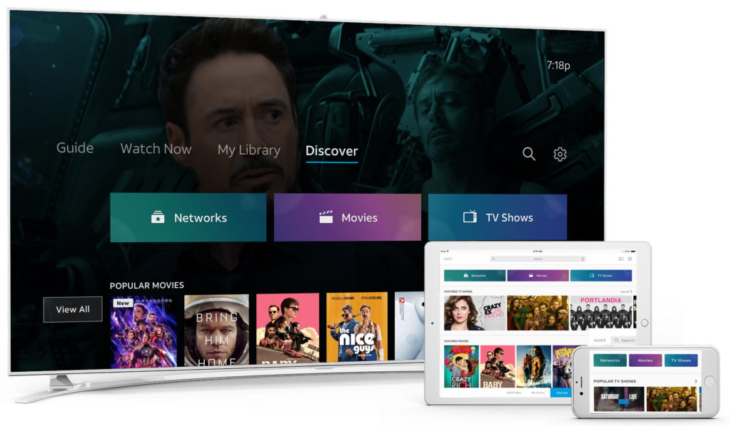
Role: Lead Product Designer
Platform: Android/Apple TV, Mobile, Tablet
THE ASK
Build a Store experience where users can explore, browse and navigate transactional content for Movies, TV Shows, Events and Subscriptions.
RESEARCH
Research Goals
- Understand and identify user personas that could benefit from the Store experience.
- Understand we may prioritize content based on video consumption habits.
- Inform design decisions based on key findings.
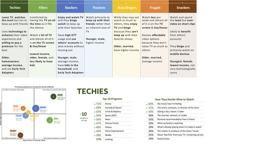
Personas Study
I started by identifying personas to help inform the types of users that may engage with the Store experience. By prioritizing these profiles, we could curate and recommend content that resonates well with each persona type based on the programs they watch.
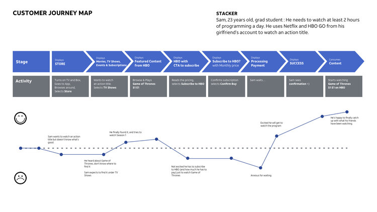
Journey Mapping
I created various journey maps leveraging candidate personas to identify touch points and opportunities to help guide our decisions with the design.
Competitive Audit
I made a competitive audit that allowed me to capture entry points, browse behavior, structure (framework, layout, metadata, and curation)
Key Findings:
- Looking at competitor’s VOD entry point, there were no consistent use of language, with some surfacing TVOD content at the home level.
- Most dedicated stores have separate movie and TV show sections, and almost all initially hide pricing of individual content.
- Featured and new content is prioritized. Most competitors use descriptive carousel headers to communicate availability.
- Most competitors do not have a dedicated subscriptions sections.
Site Map
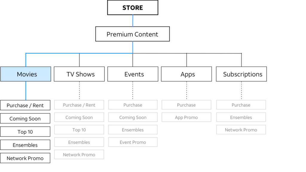
To help determine the overall architecture of Store and ensure all necessary items are present and accounted for, I built a site map to help figure out main categories and each sub-sections.
User Flows
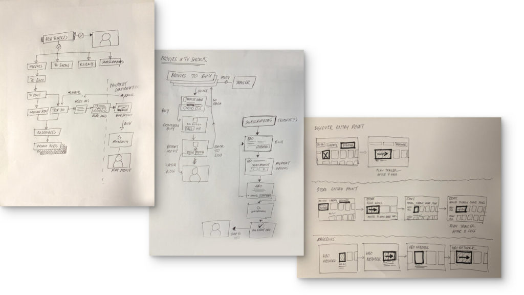
Sketching out user flows helped me visualize how someone can explore, browse and navigate through the store experience. By iterating through all possible options (from the perspective of the user) paved the way for subsequent ideation for interaction and visual designs.
DESIGN
Design Goals
- Design a flexible, modularized experience for the user.
- Make customer journey an immersive experience.
- Content can be curated and merchandised.
- Cross-platform consistency.
Featured Carousels
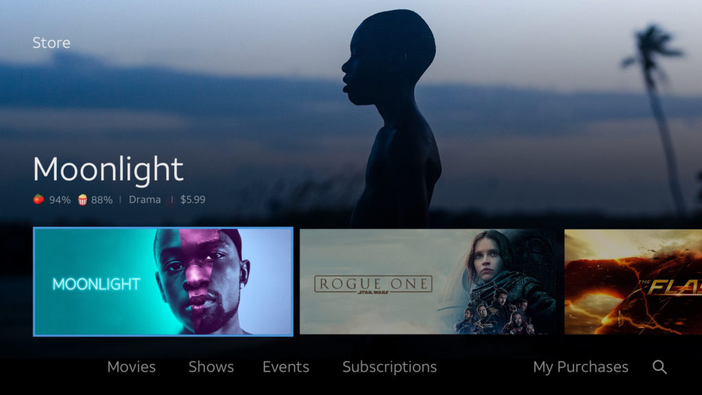
The landing page had to be prominent and provide the best real-estate to promote featured content.
Panoramic carousels with curated key art were explored along with large title headings. Ratings, genre and price would show on the default highlighted tile but goes away when background trailer starts to play.
These featured carousels would shrink to the bottom, leaving just pertinent information to bring more focus to the trailer.
Generic Carousels
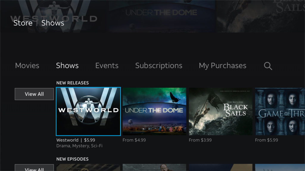
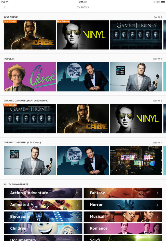
We leveraged 4:3 carousels for TV shows. For any paid content, a trailer would play after a set duration. From a previous usability study, displaying price indicates paid content without the need to use badging.
Catalogues
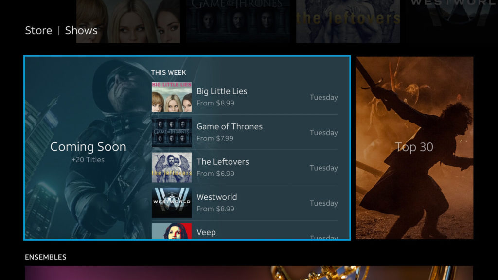
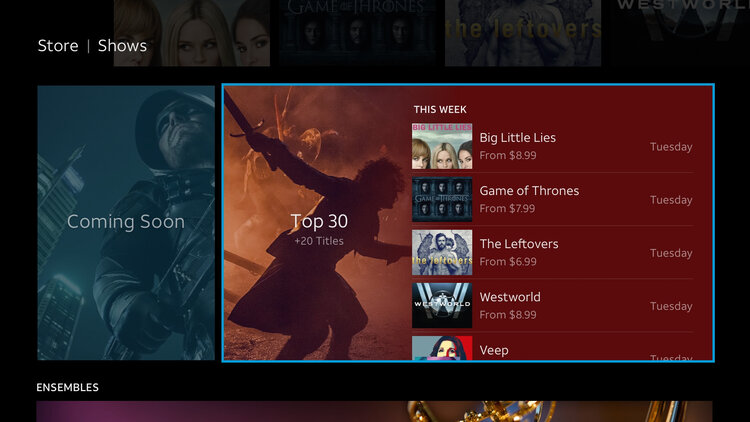
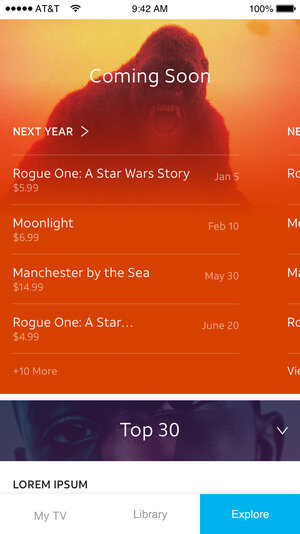
The catalogue section includes two side-by-side expandable modules that grows wider when highlighted.
We determined an ideal delay time when the title list begins to scroll vertically. Selecting each module displays subsequent (drill-in) screens.
DRILL-INS
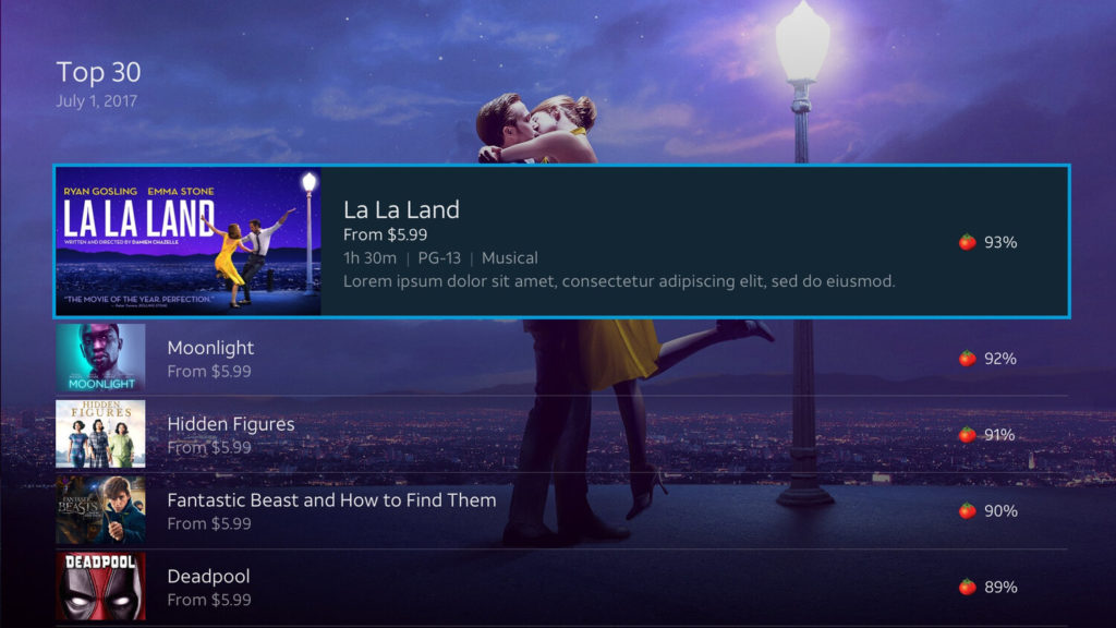
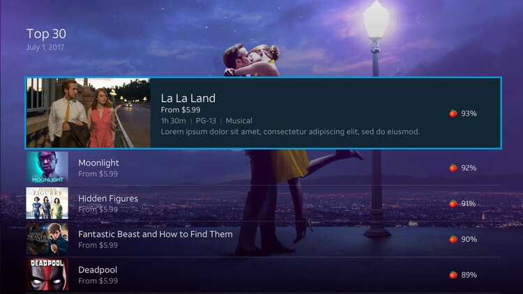
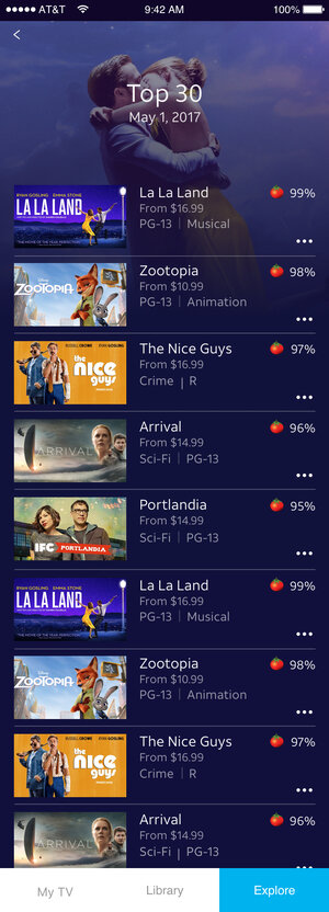
I explored several options, the candidate version uses curated background key art on the first three titles, then fades to a dark neutral color.
As part of the global pattern, a trailer auto-plays on a highlighted tile.
MARQUEES
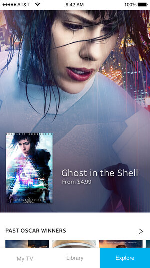
Similar to featured tiles, marquees were great opportunities for curated content and advertisements. I explored how you could leverage the same template for a show, channel, network and or pay-per-view event.


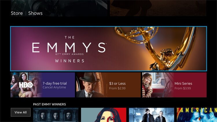
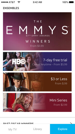
ENSEMBLES
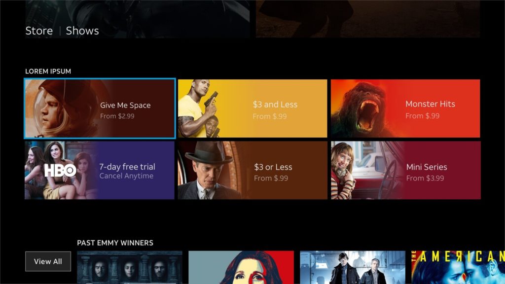
Ensembles were designed as a group of curated tiles that distinguishes itself from the generic carousels to promote the network or its content.
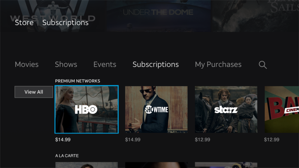
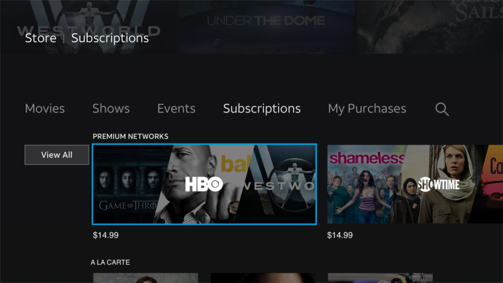
Subscription Tile Explorations
After running several legibility tests, flat-white channel logos over darkened curated tiles provided the best optimal contrast.
I also explored how panoramic tiles could look as carousels. While there is more prominence on each tile, you begin to lose how many could be displayed on the screen.

Genre Tiles
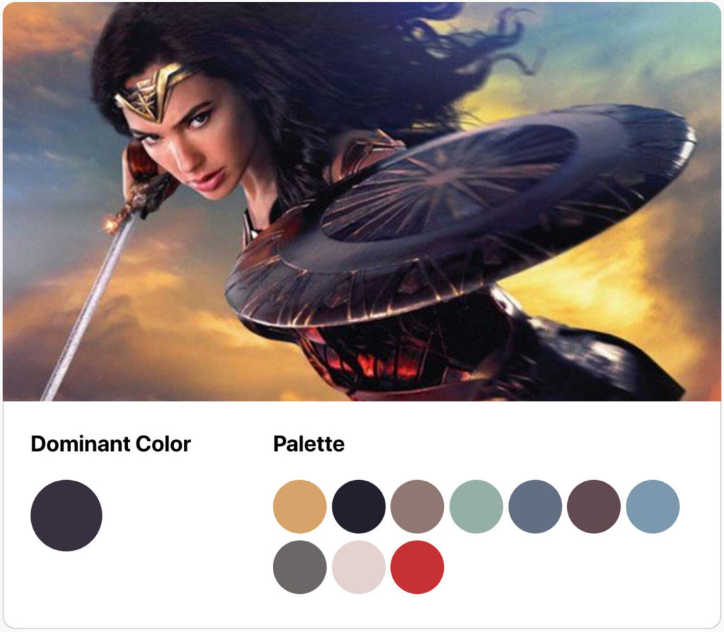
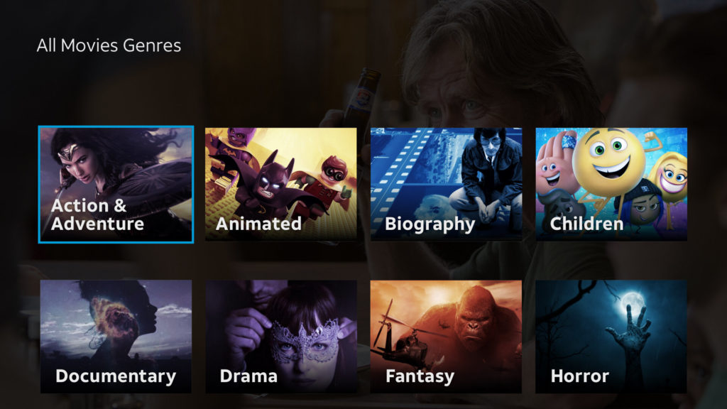
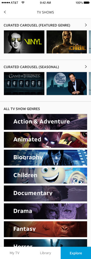
I explored genre tiles with the idea of leveraging dominant color using curated key-art to possibly be a way to automate the process in the back-end.

ENSEMBLES
CONCLUSION
This project paved the way for other areas within the app to evolve with new patterns and hopefully will inspire an ideal Store experience.