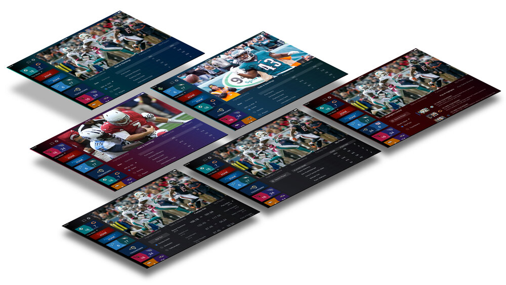
DIRECTVs’ NFLST Sunday Ticket (App) user interface had not been majorly refactored in over 10 years. As a result, Apple App Store ratings had been trending downwards. Collaborating with a small team of writers, researchers, producers and developers, this was my game plan.
Role: Lead Product Designer
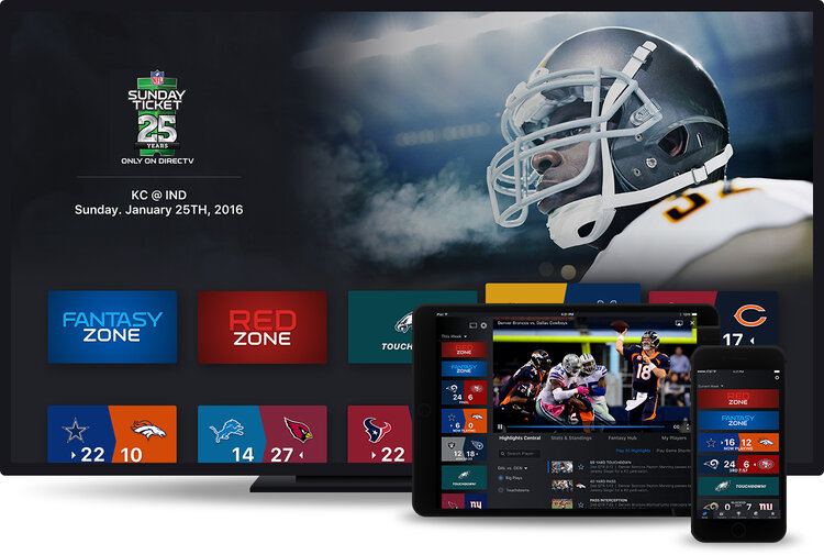
Platform: iPhone, iPad, Apple TV
PROBLEM
- Customers failed to understand game chips used in the app.
- Frustrated customers could not tell which games were blacked out.
- Customers also had legibility concerns.
THE ASK
Explore opportunities to improve the designs by addressing customer pain points.
RESEARCH
- Understand NFL user’s mental modal by studying what appeals to NFL fans.
- Identify types of emotions that correctly represents these fans.
- Inform design decisions based on key findings.
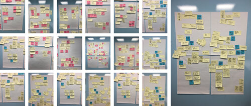
Card Sorting
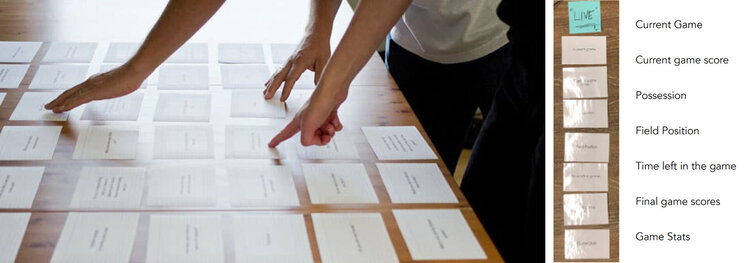
By discerning user expectations and decision- making processes, we conducted an in-house card sorting exercise with 14 participants.
Key Insights
- Live game watching experience was the most important.
- Many users separated terms “live game” vs. past / future games.
- Current game score, ball possession, field position and time remaining were crucial information for during live matches.
Narrowing Down
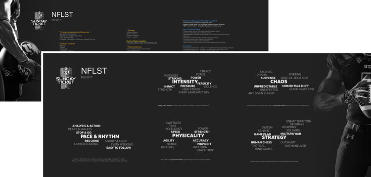
To show alignment on user’s conscious/subconscious associations with the underlying emotional pillars, we conducted implicit associations testing.
Key Findings
- NFL has the strongest emotional appeal (compared to other major professional sports leagues in the United States.)
- Translates directly into strong viewership and loyalty.
- Intense and Physical – the two most tangible attributes of the eight attributes tested.
Competitive UI Audit
- Dark and high-contrast backgrounds drive more visual impact.
- Focus on team branding, with the use of color sparks instant team recognition.
- Bold typography strongly resonates with brand.
DESIGN
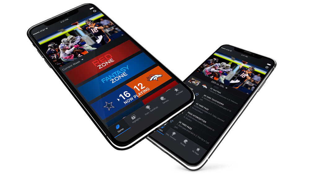
- One-screen destination to find Live games
- Fresh & easily accessible content
- Cross-platform consistency
- An extensible and modern UI
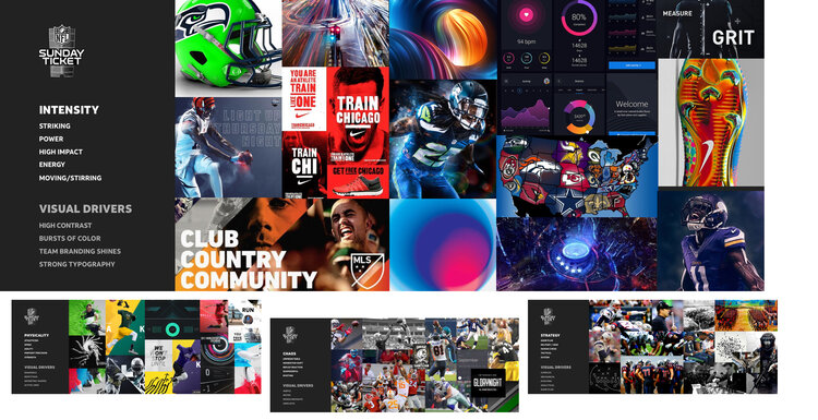
Moodboards
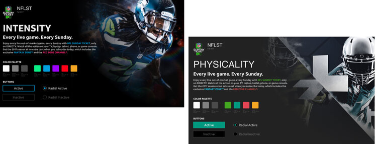
Working with the copy-writing team, I leveraged emotional pillars to create and associate visual drivers.
For example, Intensity could be associated with high contrast, strong, bold and vivid imagery, typography or color.
These were some visualization ideas around emotional pillars as they translate into visual drivers.
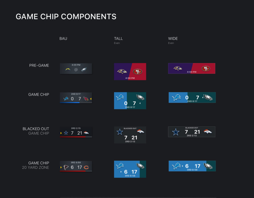
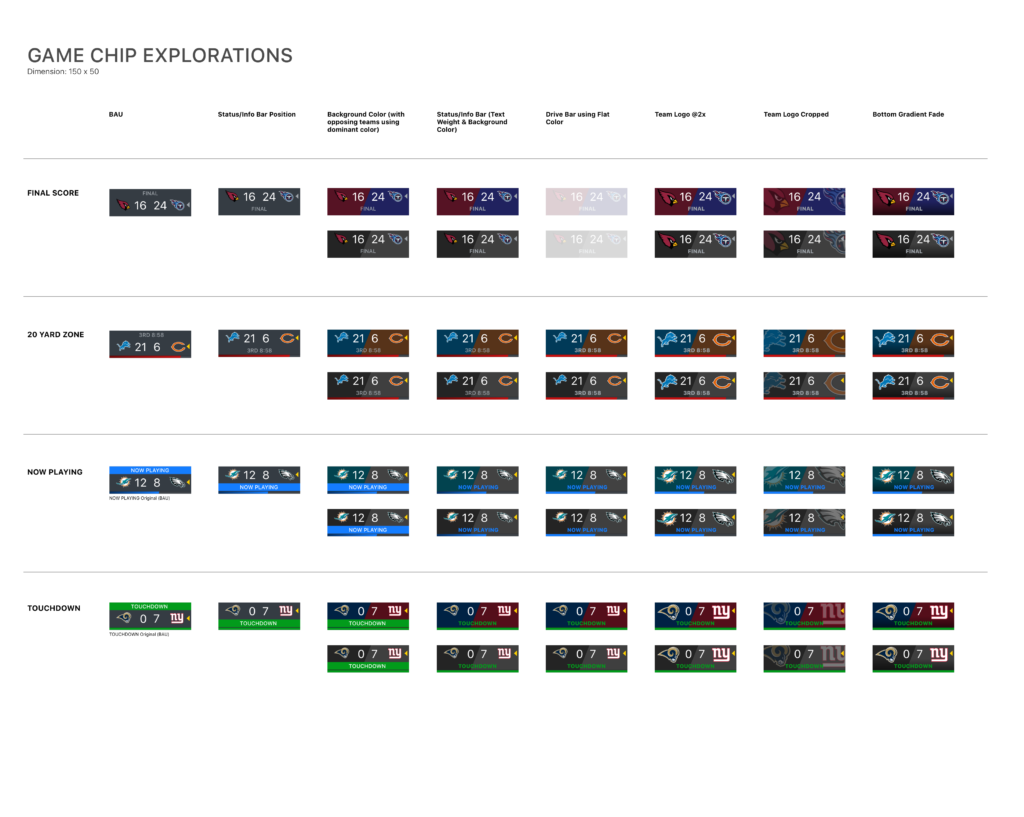
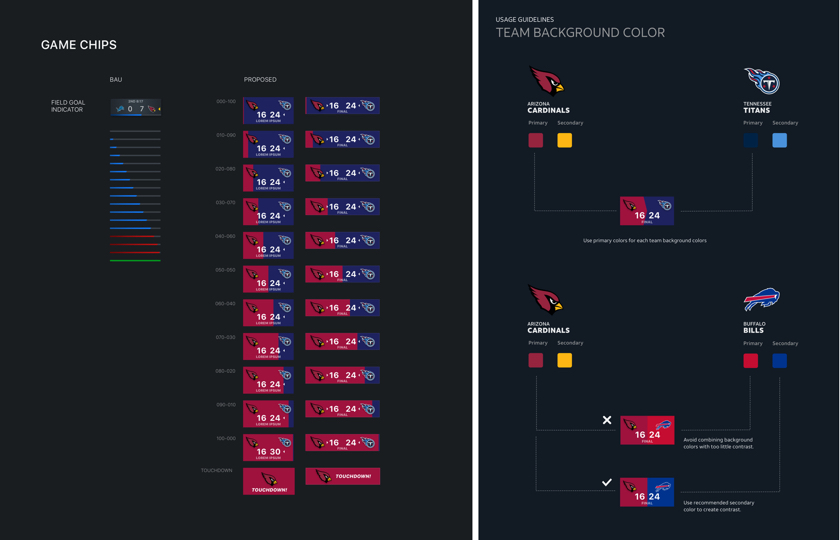
Shorter Game Chips
Tying it Together
Everything ties back to previous research studies (i.e. card sorting and emotional pillars):
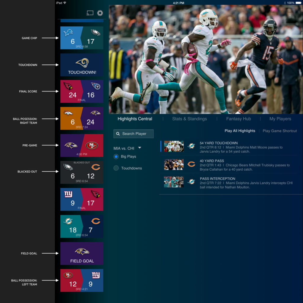
- Each game chips redesigned to represent live vs past/ present games.
- Visual drivers represented by using strong and bold team colors, typography and diagonal lines.
- Blacked out tiles more legible and clearly represented.
