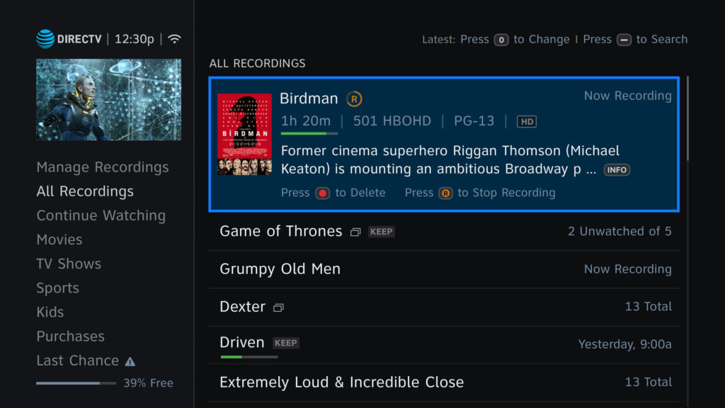
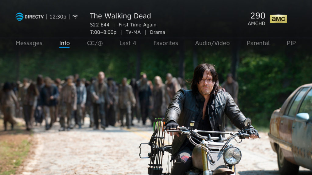
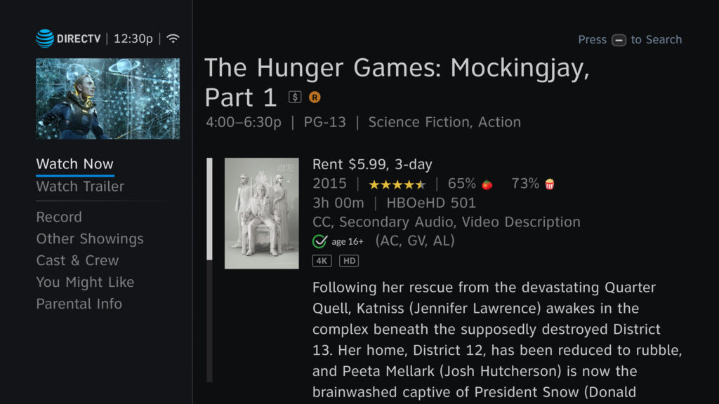
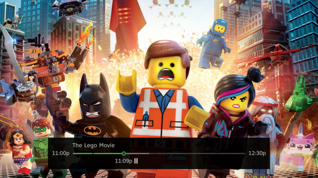
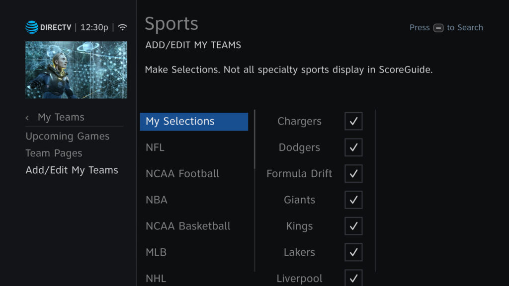
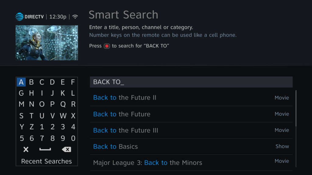
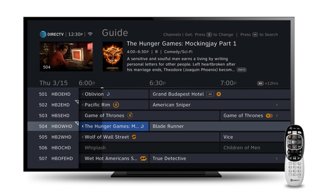
Shortly after the 2017 DIRECTV UI refresh national launch, I worked on a project to improve legibility to the designs.
Role: Lead UI Designer
Platform: TV
Skills: Requirements Gathering, Competitive Audit, Legibility Sampling, Concept Designing, Modular Designing, Stakeholder Demo and Presentations.
THE ASK
Improve legibility on major sections of the DIRECTV UI.
Product Design Goals
- Improve font contrast scores for key areas of the UI
- Keep the design integrity and maintain visual hierarchy
- Reduce visual clutter
Font Audit
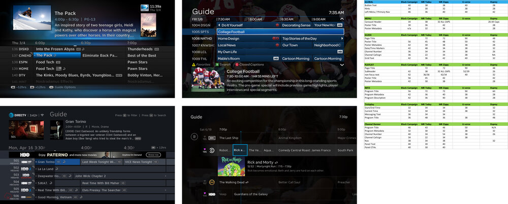
I ran a comprehensive sweep by taking measurements on font sizes, color on key sections of present and previous implementation of DIRECTV Satelite UI against DirecTV Now and U-verse. Using the comparison table, I could then see which fonts were made smaller (or larger) at a glance to determine if we needed to revert to a larger size or improve color contrast.
Color Audit
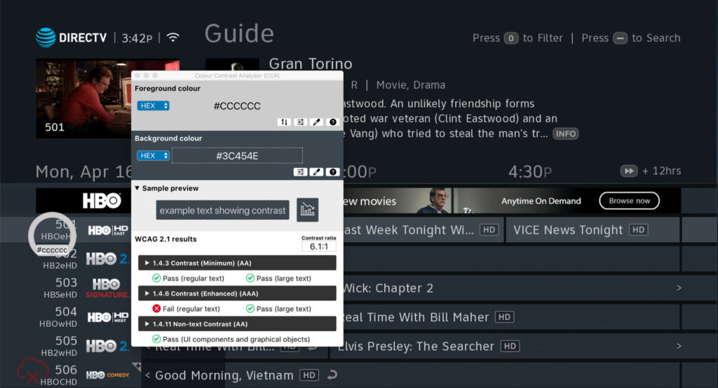
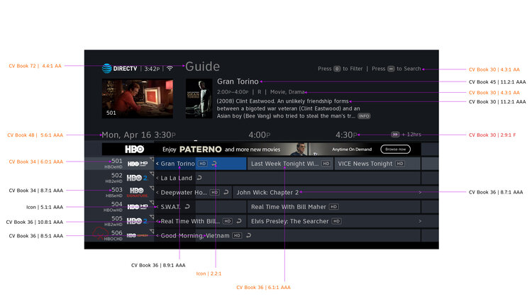
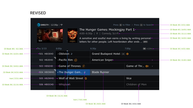
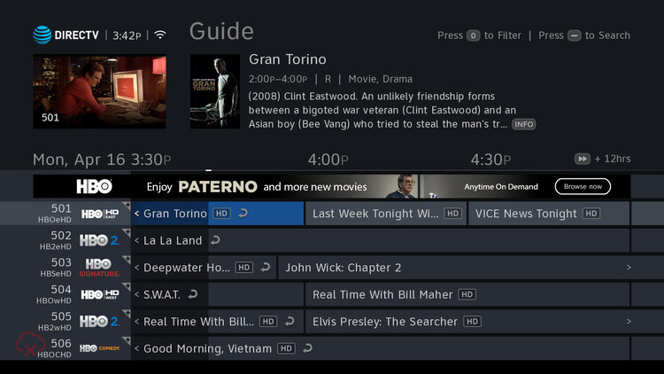
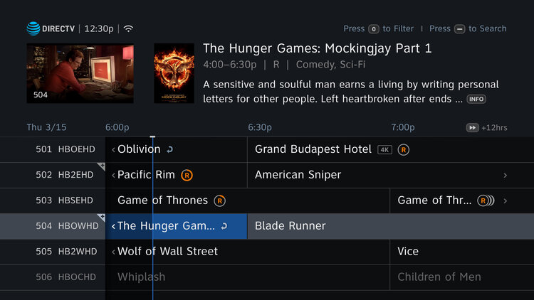
I also ran a comprehensive color contrast audit on key sections of all present and previous implementation of DIRECTV Satelite UI to make the necessary recommendations on key sections of the screen. For example, on the Program Guide (below), every single text element had significant contrast ratio improvements.
Conclusion
The overall result yielded significant improvements in contrast score, exceeding AAA standards on 95% across key sections of the UI. Customer complaints were significantly reduced since the update was released in production by mid-2018.
